“Similar. But different”: innovation in pitchbook visualizations
At Pellucid, we spend a lot of time thinking about pitchbook content. And we’ve noticed that similar to the adage “beauty is in the eye of the beholder,” innovation is in the eye of the banker.
During our research into content development, we discovered that junior and senior bankers have very different perceptions of charts and all of the variations that come with them.
Ask any junior bankers if they create bespoke benchmarking charts and you’ll hear a resounding “yes,” quickly followed by stories about some of the crazy requests they have had from their senior banker.
But if you ask a senior banker, you’ll just get told a benchmarking chart is a benchmarking chart.

To them, the millions of variations that comprise this item (metrics, comps, units, colors, labels..) are all just part of a benchmarking chart.
So why the different perspectives?
In his recent book, Invisible Influence marketing expert and Professor Jonah Berger calls this different perspectives phenomena “similar but different.”
For benchmarking charts, there are a few different forces at play that impact the final result. Social influence dictates when a benchmarking chart is used and its subsequent essential components. But each senior banker has their own way of customizing the chart to make it theirs. It’s the combination of this similarity and difference that drives innovation. You can even plot the satisfaction of senior bankers as a function of the amount of time/work spent on content. Visualizing how their pleasure increases not only as a blank canvas turns into a standard pitchbook chart, but continues to go up as differentiating “bells and whistles” are added (reducing its similarity to its banal brethren).

How does this permeate the day-to-day experience of a junior banker? Makes it mildly frustrating would be a short answer. While the junior banker can churn out a cookie-cutter version of the chart, that isn’t enough to please the senior banker as nobody wants their materials to be generic. This results in the senior banker asking for some tweaks. Such as:

1. Organize comps into labeled groups and apply distinct coloring

2. Sort data (intra-group) from "best" to "worst"

3. Add group level and all-comps summary stats

4. Supplement LTM P/E with Price / NTM earnings as a clustered bar
5. Apply logo labels
After 30-180 minutes implementation, you have your similar but different chart.
Any clients who see this chart will know what it is while it also serves to be unique as the senior banker has put their mark on it. And for the junior banker who has to created it? Well, this is one of the reasons for those long nights in the office.
What does this mean for actual innovation?
The earlier satisfaction curve has implications for other visualizations in investment banking. If you ask a senior banker which charts in their pitchbook are new, you’ll likely get a blank stare. Since software-based charts were first introduced to banking about 25 years ago, not much has changed. A couple of charts have drifted over from management consulting, such as the waterfall chart, but there aren’t many brand new visualization techniques.
Meanwhile, the senior banker tweaks that used to be unique are becoming commonplace, no longer a mark of innovation but just at best a signature twist or at worst, barely registering.
However, there is some exciting chart innovation happening across the Street, most of which leverages the similar but different rule. Usually, they borrow an existing visualization concept but apply it in a different way that leads to more information.
For example, take the comps table below. Pretty generic.

There are only so many bells and whistles that can be added to this, and ultimately they don’t do much. And this is not an easy chart to present to; it is as if the visualization method is working against you, even though it has all of the necessary information.
Given the wealth of data in the table, ideally, you would be able to talk about the absolute values, relative values, and any relationship between the variables. But the above table doesn’t help with this. You can pick out absolute values, but anything above this is a stretch.
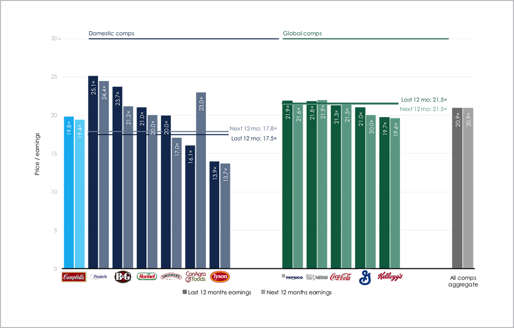
How about reimaging this table into a ranking chart? It is the same data, but an entirely different outcome, with a story that jumps off the page.

You can highlight areas of strength and weakness for your clients, talk to how the fields relate to each other and give more than just data, but share insight, serving a purpose that’s similar to the comps table, but different. And definitely better.
Any failed visualization techniques you’ve tried or would like to see evolve? Email me at adrian.s.crockett@gmail.com.