Data needs visualization AND transformation
A side-effect of big data is that in an effort to extract insights from it there has been an increase in the misuse (or in my opinion, abuse) of data visualizations.
Data visualizations are needed to access knowledge from vast sets of numbers. As I’ve covered before, humans are wired to process information visually and if a banker can unlock insights using a powerful data visualization...well it can be very persuasive. There’s a reason pitchbooks are filled with charts.
But what is often neglected—and a common source of frustration for myself and others—are the skills needed to choose the optimal visualization and the ability to transform that data into something meaningful.
Data visualizations are extremely common. Google trends show a steady increase in the search term over the last five years and on Twitter the #dataviz hashtag is used at least once a minute. But just because data visualizations are receiving more attention doesn’t mean they are always being made correctly.
Unfortunately, it’s commonly believed a visualization can be slapped onto any set of data and boom! Insights will immediately leap out. But this is just a waste of your and your clients’ time.
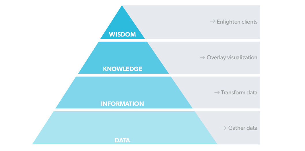
As always, I turn to a pyramid to solve this. Not an ancient one, but a methodological one that effectively shows structure and approach.
I love a good pyramid; and data, information, knowledge, wisdom (DIKW) is a good one. It illustrates the transformation of data from raw numbers to wisdom by being pushed up the structure.

How is this applied?
Imagine you’re advising Apple and its latest quarterly results came out. You could:
1. Just visualize data
Present a simple visualization that takes the raw data (numbers Apple already know) and makes the information pretty. This isn’t really that value-added is it?
2. Transform and "wisdomize" data
Transform the raw data into a series of informative ratios, add perspective with comparable comps analysis, and then select appropriate visualization techniques that let the wisdom jump out and enlighten your client.
If presented with these two approaches (which you are every time you make a chart), the second is the obvious winner, and there are two steps to get there.
Dig deeper into your investment banking knowledge base and push the data up the DIKW pyramid, so it’s actionable for you and your client. See The democratization of data and investment bankers for more on this.
Next, turn the numbers into meaningful content. Take the transformed data and select a visualization technique that brings the message home. If a picture tells a thousand words, transformed data is the paint and the visualization technique is the frame.
While data visualizations may have become more popular, if you apply them in the wrong way, you don’t help your message but hinder it.
If you use the DIKW pyramid approach to marry your inner data scientist and visualization designer with your outward financial analyst, your enlightened clients will thank you.
What else about the trends of data visualizations is getting your goat? Or if you have a good pyramid, I’m down for that, too. Email me at adrian.s.crockett@gmail.com.